How to Mix Patterns: Contrast is key
It’s all about contrast. Your patterns can’t be too close in size, boldness, or color. It screws with your head. There should be a clear visual break between your layers. That way a person’s brain doesn’t have to hit overdrive attempting to figure out just where your shirt stops and your jacket begins.
Mixing patterns is a lot like telling a joke. It’s all about creating just enough surprise, disruption, etc… without going so over the top that it’s uncomfortable, or being so subtle it’s hard to understand. You want balance. Here’s a (somewhat) easy way to do it:
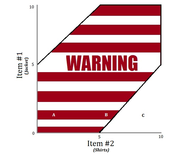
Assign each patterned piece of clothing you’d like to wear together a number. Ballpark their level of boldness. Zero is extremely subtle. Ten is pretty bold. Patterns get bumped up a few notches if they’re different (stripes vs checks) since they’ll contrast and more easily noticed when they run into each other. Now, let’s chart a few examples…
Combo A: The INC Ultra Light Jacket and Red Check shirt have almost the exact same pattern at the same level of intensity. That’s hard on the eyes and buries it in the warning zone.
Combo B: The INC Ultra Light Jacket and Blue Light Stripe Shirt have a similar size pattern, but the pattern and color contrast is different. Still a little close for most to pull off. A solid tie would help.
Combo C: The INC Ultra Light Jacket and Blue Bold Bengal Stripe shirt patterns are different in shape (check vs. stripe), spacing, and intensity. That puts it in the safe area.
.
The Bottom Line
All MS Paint created graphs aside, the fail-safe method is to make one pattern bold and the other subtle. Wearing a worsted wool suit? Wear a thin stripe shirt and rugby block-stripe tie. A gingham shirt? Try it with a solid jacket and pencil stripe pocket square. You want contrast in pattern and intensity, all without looking like an Iron Butterfly video. And when all else fails, just wear one bold pattern with a bunch of solids.
Now as Brian Wilson from the S.F. Giants would say, “let’s get weird.”

