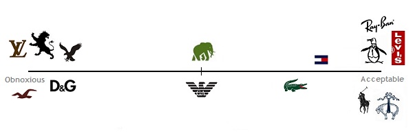
Wearing Logos – Obnoxious vs. Acceptable/Ignorable
Some of you have a zero tolerance policy when it comes to wearing logos. And most of us who aren’t quite zero tolerance (and in some cases, consider some logos even to be a guilty pleasure), we get it. Totally understand that you don’t want to be a walking billboard. But if you’re really zero tolerance, do you rip the red Levi’s Tag from the back of your jeans? What about your watch? Do you put a small square of electrical tape over the brand’s marque, like it’s a busted VCR flashing 12:00?
Logos are everywhere, and sometimes an otherwise well fitting & good looking garment gets ruined by that brand’s desire to advertise itself post-purchase. But often the logo is barely noticeable or so timeless that it’s not that big of a deal.
So where do you draw the line? What’s bragging, what’s tacky, and what’s just fine? For purpose of getting to the bottom of this, here’s a starting point. The obnoxious logos are to the left, and the more accepted and/or more ignorable logos to the right. The not often used Banana Republic Elephant and Armani Eagle sit on the fence:
Some notes:
- Notice there’s no Abercrombie & Fitch or Ed Hardy on the graph. Those are off the chart.
- Yes that’s a Hollister Logo near the Louis Vuitton. Rarely if ever mentioned on this site, they both puke their logos .all over everything. Louis Vuitton is what Hollister addicts buy when they win the lottery.
- If it were 1999, Hilfiger would be on the far left side. He’s toned down the use of the logo, & come a long way.
- The bigger the Ralph Lauren Pony, the farther to the left it should slide
- Notice there’s no J. Crew on the graph. Points to them for not shoving a visible logo on all their stuff
- There are exceptions to every rule, and the logo doesn’t necessarily reflect the character of the wearer.
What’s missing & where would you put it? Agreements, disagreements, & additions go in the comments section.
