The Best and Worst World Cup Jerseys – From Randall Simon’s Sausages
It only happens every four years, and unlike the Summer or Winter Olympics, people actually care about this thing. The World Cup is about to launch and I’m personally looking forward to one month of the planet’s biggest game on the game’s biggest stage.
You look good, you play good. Disagree with that? See the 76′-77′ Buccaneers if you need some evidence. And the guys at the Sports Blog Randall Simon’s Sausages (you’d either have to be a Brewers or Pirates fan to get the reference) have ranked all 32 teams based on uniform. Here’s their list. The Dappered.com picks for the Top 3 and Bottom 3 are below.
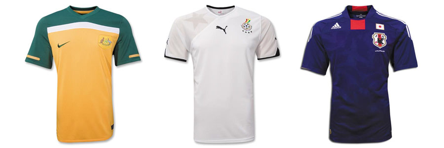
The Top 3 – Australia – $70.00 | Ghana – $70.00 | Japan – $70.00

1. Australia – Gotta love the not too-bright green and yellow combination with the high chest stripe. The blocky green shoulders that go right into the sleeves are only going to make the big rugby loving Aussies look even bigger. Plus, the left chest has one of the best coat of arms of all time. Kangaroo + Emu = Awesome.
2. Ghana – Puma designed the jerseys for all the African Nations this year and they did a great job. Each team has their nickname printed in shadow on their right shoulder, and Ghana’s national team is known as the black stars. Randall Simon’s Sausages prefer the animal mascots, but I think simplicity wins out. Ghana’s jerseys are clean and to the point with some terrific sleeve piping.
3. Japan – This made the original lists bottom three, but I think they’re pretty slick. A bit busy, but still. The deep blue is perfect, the crest looks great, and I even like the tonal leaf pattern (are those leaves? Feathers?) on the front. As long as they don’t stand out and shimmer too much, I think they’re pretty cool addition. But if they’re super noticeable, I’ll be eating my words along with a nice hot bowl of Miso come kickoff.
Honorable Mention: Brazil (Classic) Spain (Also Classic) and New Zealand (Tough to screw up black and white)
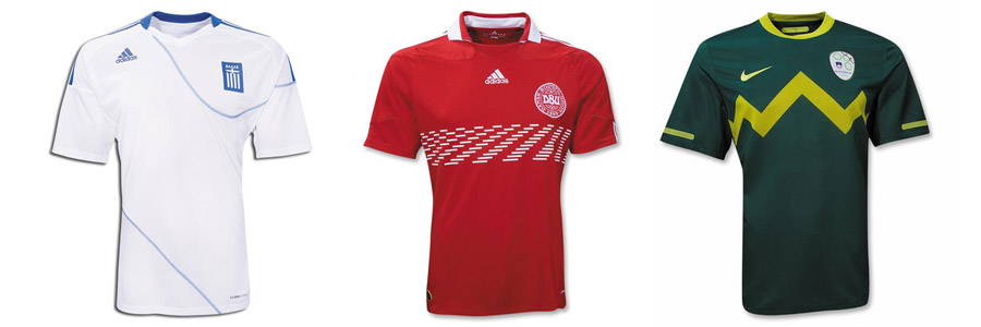
The Bottom 3 – Greece – $70.00 | Denmark – $70.00 | Slovenia – $70.00

30. Greece – I know Greece is in the middle of a financial crisis, but couldn’t they have paid for a uniform that didn’t look like it was inspired by chutes and ladders?
31. Denmark – Randall Simon’s Sausages says it looks like the old video game Breakout, and you can’t deny the Atari Influence. I’m also seeing the Alligator heads in Pitfall, which means the first time a Danish player goes down on the pitch, this needs to be played in the stadium.
32. Slovenia – Looks like something Charlie Brown’s Evil twin would wear. They say it’s supposed to represent mountains. If I were a mountain, I’d be insulted.
Dishonorable Mention: England (C’mon. It’s a soccer match, not an afternoon at the yacht club,) France (looks like someone got attacked by a tiger. Speaking of…) South Korea (I can’t not think of this when I see those stripes),
Enough 80s references. Enjoy the games.
Agreements? Disagreements? Anyone got a pick to win it all? Leave the comments below…