Some of you have a zero tolerance policy when it comes to wearing logos. And most of us who aren’t quite zero tolerance (and in some cases, consider some logos even to be a guilty pleasure), we get it. Totally understand that you don’t want to be a walking billboard. But if you’re really zero tolerance, do you rip the red Levi’s Tag from the back of your jeans? What about your watch? Do you put a small square of electrical tape over the brand’s marque, like it’s a busted VCR flashing 12:00?
Logos are everywhere, and sometimes an otherwise well fitting & good looking garment gets ruined by that brand’s desire to advertise itself post-purchase. But often the logo is barely noticeable or so timeless that it’s not that big of a deal.
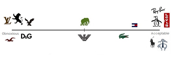
So where do you draw the line? What’s bragging, what’s tacky, and what’s just fine? For purpose of getting to the bottom of this, here’s a starting point. The obnoxious logos are to the left, and the more accepted and/or more ignorable logos to the right. The not often used Banana Republic Elephant and Armani Eagle sit on the fence:
Some notes:
What’s missing & where would you put it? Agreements, disagreements, & additions go in the comments section.
Sunglasses. Swim trunks. Sweater polos. Suede chukkas and loafers. Huckberry's annual summer sale is on.
From Target clearance t-shirts, to 43% off Brooks Brothers 1818 line Italian suits.
Linen-wool sportcoats, UK made dirty buck chukkas, and longingly looking (very) forward to fall.
In person with BR's flagship suit separates.
Significant savings. While they last. Which usually isn't very long.
One of the best affordable watch releases in recent memory. Yours to win. Perhaps.